The Psychology of Menus: How Digital Design Influences Dining Decisions

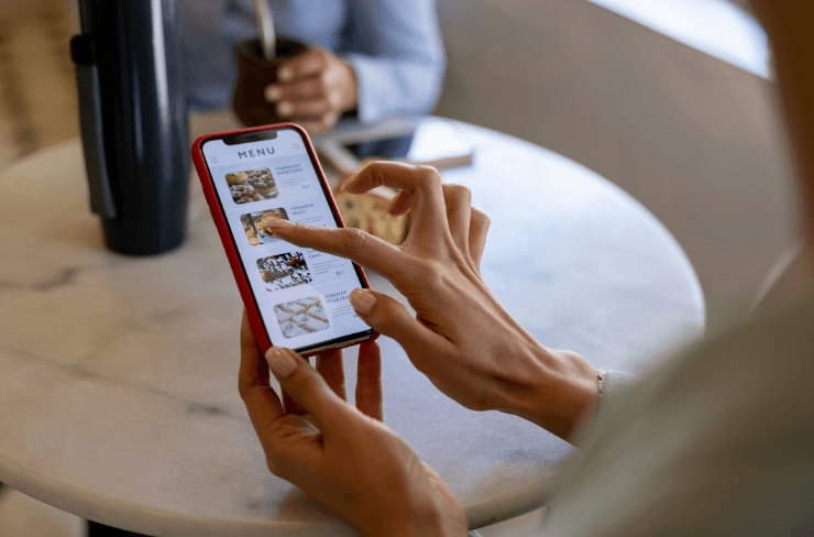
When guests open your restaurant’s digital menu, they are not just browsing. They are making decisions shaped by subtle design cues, colours, images, and words. A digital menu is more than a list of dishes - it’s a strategic tool that guides choices, influences perception, and enhances satisfaction.
Restaurants that understand how design impacts behaviour can create menus that feel effortless yet persuasive. In the UAE’s competitive dining scene, where experience matters as much as flavour, that understanding makes all the difference.
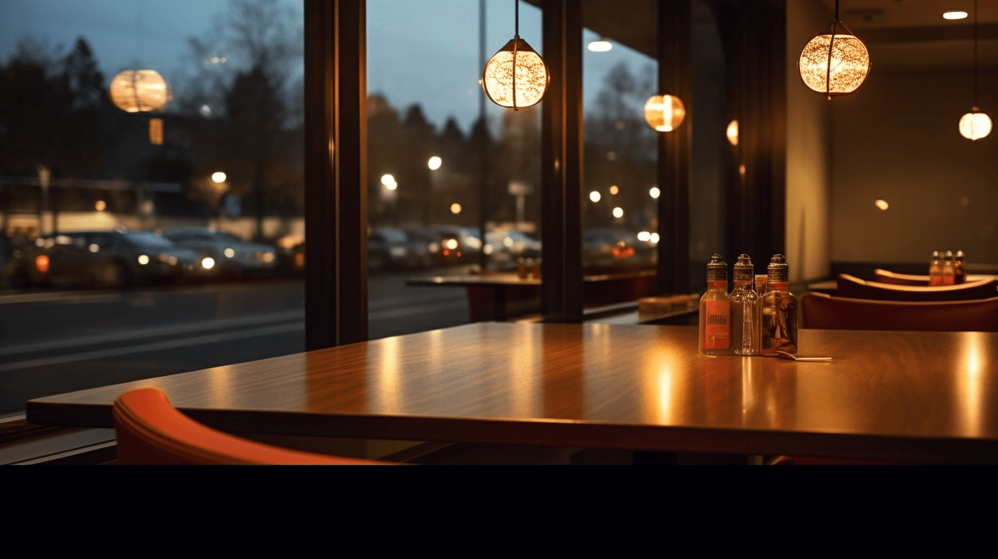
First Impressions Start on the Screen
Guests form opinions about your restaurant long before their food arrives. Often, it starts with the menu. A well-structured, visually cohesive menu immediately conveys confidence and care.
Digital menus offer more control than printed ones. You can balance bold imagery with clean spacing, highlight your brand colours, and ensure guests can find what they want without feeling overwhelmed. When a menu looks polished and intuitive, it subconsciously tells guests that the same attention to detail applies to your kitchen and service.
Visual hierarchy also plays a role here. By using larger text for section headings, subtle highlights for bestsellers, and consistent alignment, restaurants can gently guide the eye without the guest even noticing. Those small design details build trust before the first bite.
Words That Influence Choices
A well-chosen description can do more for a dish than a photograph. Guests use words to imagine taste, texture, and quality. The right phrasing triggers emotion and anticipation, making a dish feel irresistible.
Instead of vague adjectives like “delicious” or “flavourful,” focus on what makes a dish unique. Describe how it’s prepared, what ingredients stand out, or where it originates. For example:
“Slow-braised short ribs with caramelised onions and thyme jus”
feels far more enticing and trustworthy than
“Tender beef in rich gravy.”
Digital menus allow you to expand on details without clutter. You can layer information — show a short description at first glance, then let curious guests tap for more about sourcing, allergens, or preparation. This clarity not only boosts appetite but also reinforces transparency, a growing priority for today’s diners.
Guiding the Eye, Guiding the Order
On a mobile screen, attention behaves differently. Guests don’t scan across two pages - they scroll vertically, moving through the menu one section at a time. The goal isn’t to direct their gaze to corners or patterns but to create a smooth, intuitive flow that helps them find what they want quickly.
When designing for mobile, structure matters more than space. The order of sections, the clarity of headings, and the pacing of visuals all influence what guests notice first and what they’re drawn to next.
Here’s what works best for digital menus on mobile:
- Lead with your strongest items. Guests make quick decisions when browsing. Placing your signature dishes or bestsellers at the top of each category keeps them visible and easily accessible.
- Give every dish a visual cue. Mobile users expect imagery for all items, not just highlights. A photo for each dish helps guests compare options instantly and builds confidence before they place their order.
- Keep descriptions short but meaningful. Long text feels overwhelming on smaller screens. Use concise, sensory language that tells guests exactly what to expect.
- Design for pace, not position. Break the menu into digestible sections so guests can scroll comfortably rather than face an endless list.
Unlike printed menus, a digital layout thrives on adaptability. Restaurants can reorder items, replace visuals, or spotlight new dishes instantly - keeping the experience fluid, modern, and aligned with how guests actually browse.
Designing for Decision Confidence
Great design is invisible. Guests should never have to think about how to navigate your menu - it should feel effortless. When information is easy to find, decisions are faster, and satisfaction increases.
Use colour intentionally: contrast light text on dark backgrounds or vice versa for readability. Choose clear fonts that align with your restaurant’s tone, and keep images consistent in size and lighting to avoid distraction. Grouping dishes by theme, dietary category, or portion size can also help guests make confident, informed choices.
This sense of ease affects the entire dining rhythm. When guests spend less time deciphering the menu, staff spend less time clarifying it. That creates smoother service, shorter wait times, and better flow between table turns.
Building Emotional Connection Through Design
A digital menu is part of your brand’s storytelling. Every design decision - from the palette to the phrasing - communicates personality. A coastal café might use ocean blues and minimal layouts to evoke calm, while a Lebanese restaurant might lean on warm tones and rich patterns to reflect hospitality and tradition.
Consistency between what guests see online, on the menu, and in the restaurant reinforces authenticity. It tells guests they’re in the hands of professionals who care about every detail. The emotional impact of that consistency often lingers longer than the meal itself.
A digital menu is more than a tool for ordering. It’s an experience in itself - a quiet but powerful part of the dining journey. When executed thoughtfully, it acts like an extension of your best server: attentive, informative, and persuasive without pressure.
Reach out to Redro to move your paper menu into a digital one.


Join the Culinary Revolution!
Transform your dining experience with Redro. Boost efficiency, delight diners, and fire up your sales. It’s more than a menu—it’s a game-changer for your brand.